
The case for carousels - an interview with The Productivity Method's social media manager, Rebecca
The case for why the format everyone wrote off is now outperforming everything else, and how The Productivity Method is using it to build a world, not just a feed.

I‘ve been called the “carousel queen” more times than I can count, and for a while I thought maybe that was becoming a dated thing to be known for. Our industry’s spent the last god-knows-how-long telling us all that short-form video was the only path to reach. Prioritise Reels, film yourself talking, hop on trending audio - anything else and you’re basically shouting into the void.
So when carousels started outperforming Reels in every engagement metric that actually matters - look, I'm not saying the carousel queen deserves an apology. But she wouldn't say no to one…
Let’s talk about what the data actually says, and then I want to introduce you to someone whose work has become one of my favourite examples of carousels done right.
Juicy data.
Buffer analysed over four million Instagram posts and found that carousels earn 12 percent more engagement than Reels and more than double the engagement of single images. They also generate the highest save rates of any format - and saves are one of the strongest signals to the algorithm. On LinkedIn, Socialinsider’s 2025 study of one million posts put multi-image carousels at the top of every engagement metric. And Mosseri said it himself - more images mean more chances to interact, and more interactions mean more reach.
Video isn't going anywhere, but the monopoly on reach is over (thank God).
Why now?
Platforms are optimising for time spent, not just views. Every swipe signals quality to the algorithm. And audiences are exhausted by the pace of short-form video - completion rates are declining, and not everyone wants to be on camera, which is something I think we need to normalise more than we do.
Carousels let people control the pace: you can re-read, absorb, save it, come back to it. The engagement is slower but deeper - and I think that’s what both audiences and algorithms are starting to reward.
The brand that's proving it.
When I was thinking about who I wanted to feature in this piece, there was really only one answer. The Productivity Method has made carousels a core part of its content strategy - and it’s working. 77,000 new followers and 119 million views last year alone.
I sat down with their social media manager Rebecca to talk about how they think about carousels, from the strategy behind them to the actual process of making them. Here’s what she shared!
It starts with how your audience feels, not what you're selling.
TPM’s goal on social isn’t to post about planners - it’s to be the go-to place for women who want to get their life together. That means thinking about how their audience feels in that exact moment. Is she in a slump? Does she want career advice? Style advice? A reason to feel like she’s got this?
“Every piece of content is built to meet her where she is,” Rebecca told me. “The product gets woven in, never forced in.”
Most brands start with the product and work backwards to the audience. TPM starts with the audience and lets the product find its place. That difference shows up in everything they post.

Rebecca also mentioned interesting: while views are a useful indication of reach, they’ve been honing in on saves and shares as more valuable indicators of performance. And often, their carousels get the same number of saves or shares as they do likes - sometimes more. Their content’s not just being consumed, it’s being kept.
The best carousel ideas don't come from a content calendar.
At TPM, carousel ideas come from the community: polls on stories, things people DM about, frustrations shared in comments and question boxes. Rebecca uses all of that as her starting point rather than sitting down to brainstorm in isolation.
One example she walked me through: their “how to anti-rot your evenings” carousel. The idea came from their community saying they wanted to stop doom-scrolling before bed. Rebecca researched offline wind-down routines, weaved in planning tips, and then, crucially, reframed the whole thing with a hook that felt current and evocative.
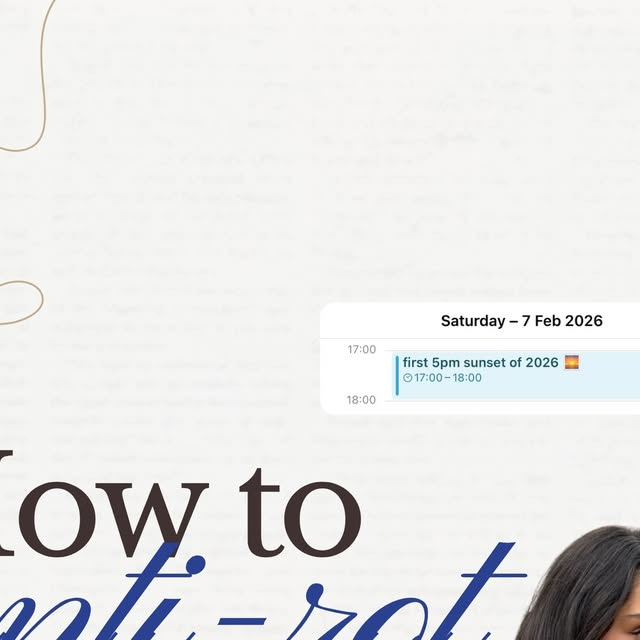
Instead of “5 evening tips” she went with “anti-rot your evenings” - tapping into the language her audience is already using, the dopamine menus and offline hobbies and digital detox conversations that are everywhere right now. The hook didn’t just describe the content, it made the content feel like a mirror. And that’s the difference.
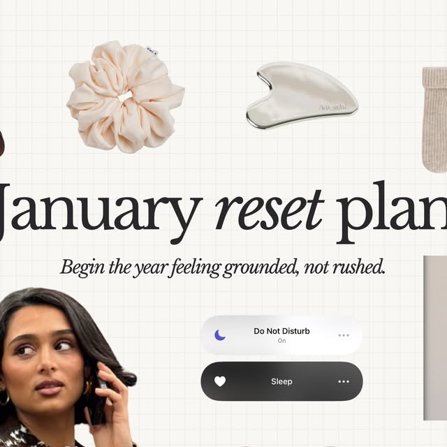
“I’ve experimented a lot with hooks, “’How to’ and ‘your [month] reset’ styles consistently perform because they anchor the content in the now. Engagement peaks when content feels like a mirror - something your audience sees themselves in, rather than inspiration at a distance.”
Your feed should feel like something people step into.
Every TPM carousel is positioned within a feeling rather than a product benefit. “How to get out of a slump” works because everyone’s been there. “Anti-rot your evenings” works because it mirrors something her audience is already experiencing. The topic earns the swipe before the design does.
But what really sets their content apart is how all of those choices compound into something bigger.
“We want our carousels to almost feel like a subscription to a magazine - the go-to place for life advice and getting your shit together. In terms of visuals, we often include other brands that our audience might associate with. We ask ourselves, where is she shopping? What brands does she like? Including those familiar visuals adds to the world and allows us to meet her where she is.”
And TPM doesn’t just make carousels that look good, every visual decision ties back to what they actually sell.
“Being a planner brand, having paper-effect backgrounds, layered scrapbooky visuals, handwritten fonts and notes - tt all makes it feel tactile. And that’s been built through repetition and intentional design choices over the past year.”
Their carousels feel like a peek into what your planner could be. You’re not being shown the product - you’re being shown the feeling of using it.
Carousels aren’t dying, people are craving what they offer.
Rebecca’s been doubling down on carousels for over a year and hasn’t seen a drop in engagement.
“I think with the rise of people craving analog, carousels definitely feed into this. Taking time to read through a curated, well thought out piece of content breaks up the feed that’s just endless video and scrolling.”
Carousels ask something of you: you have to read, swipe, actually engage your brain in a way that video doesn't demand. That's exactly why they're working - people are tired of content that just washes over them
Case closed.
If you’ve been making carousels and wondering whether to pivot to video, I hope this gives you permission to keep going! And if you’ve been avoiding carousels because they felt outdated, maybe it’s time to give them another look.
Thank you to Rebecca for being so generous with her time and her process — go and follow @theproductivitymethod if you don’t already, because their feed is one of the best examples of carousel content done well.
This was the first interview on The Case, and I loved doing it - if this is a format you want to see more of, let me know who you'd want to hear from next. Until then, see you next Monday!
I didn't know you are on substack!!!! This is the best!!!!!!!
Their carousel designs are fantastic! Is there any chance of finding out what software they use to create them?